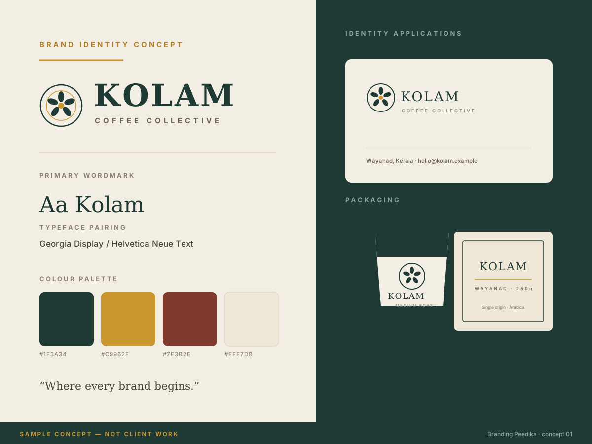
 Brand identity
Kolam Coffee Collective
Identity direction for a sample single-origin coffee brand — wordmark, palette, packaging and collateral.
Portfolio
A gallery of original demonstration work created by Branding Peedika to show how we think about brand identity, content, packaging and websites for local businesses.
The work
Each concept was designed around a realistic brief for a business of a particular size, and each is labelled with the kind of problem it was solving.
These are sample concepts, not client work. Every image on this page is an original demonstration piece produced by Branding Peedika. The brands shown are fictional, no client project is represented here, and no outcome is being claimed.
Brand identity
Identity direction for a sample single-origin coffee brand — wordmark, palette, packaging and collateral.
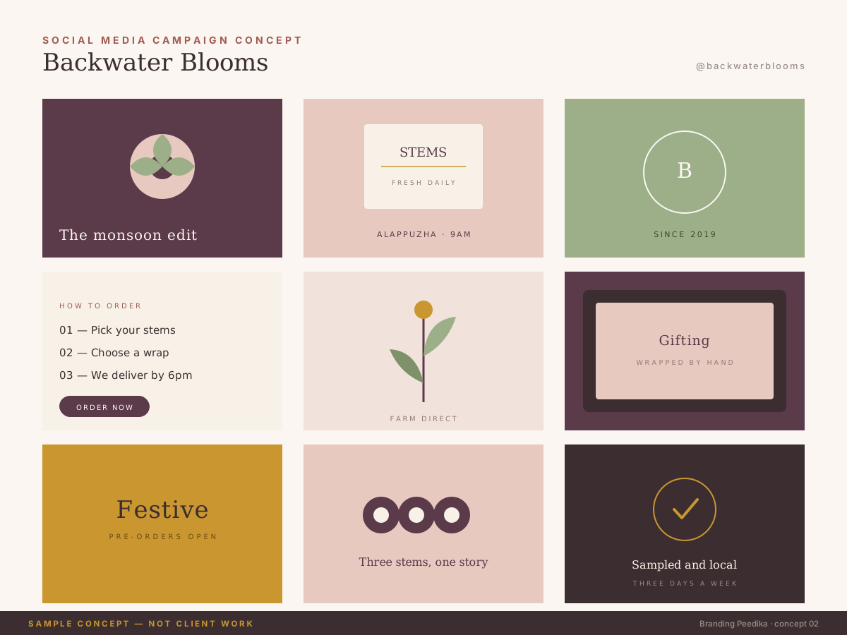 Social media
A sample content grid showing how a small local brand can look consistent across a feed.
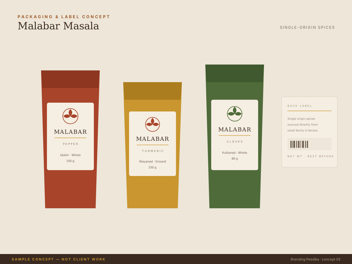 Packaging
Label and packaging layout concepts for a sample spice brand, built around one repeating emblem.
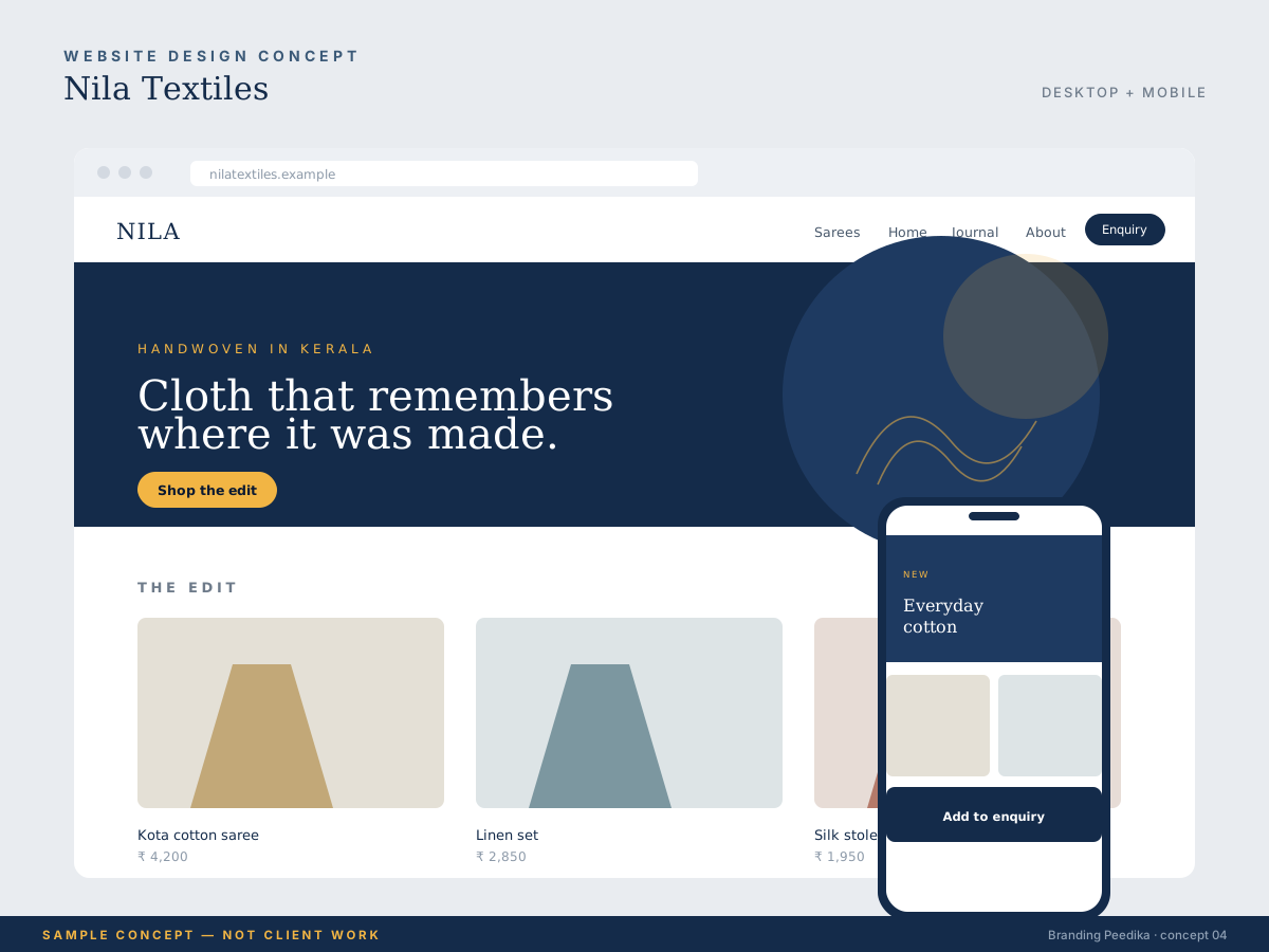 Web design
A sample site layout balancing a strong first impression with a simple path to enquiry.
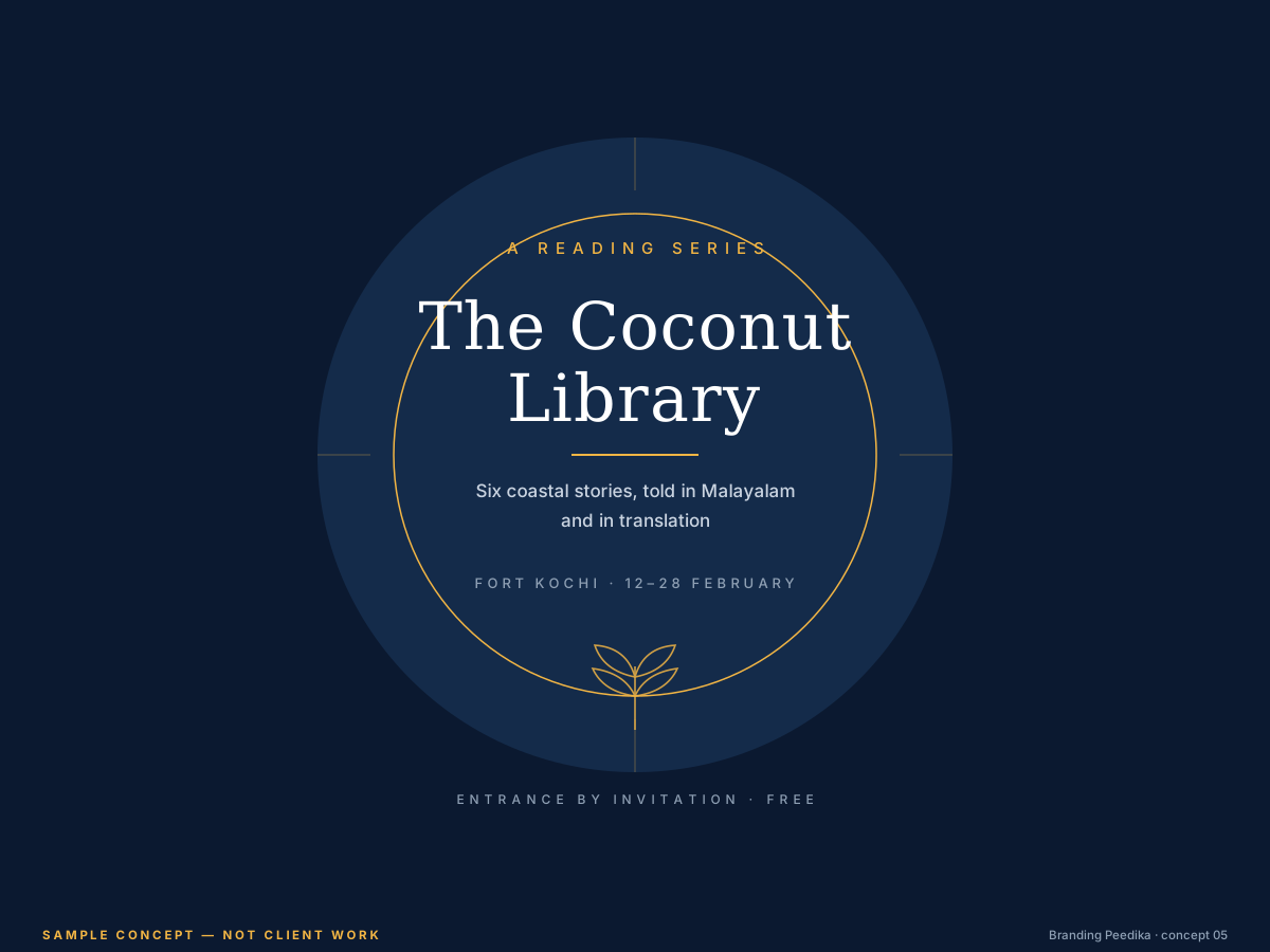 Poster
A sample event poster direction that stays readable from a distance and on a phone screen.
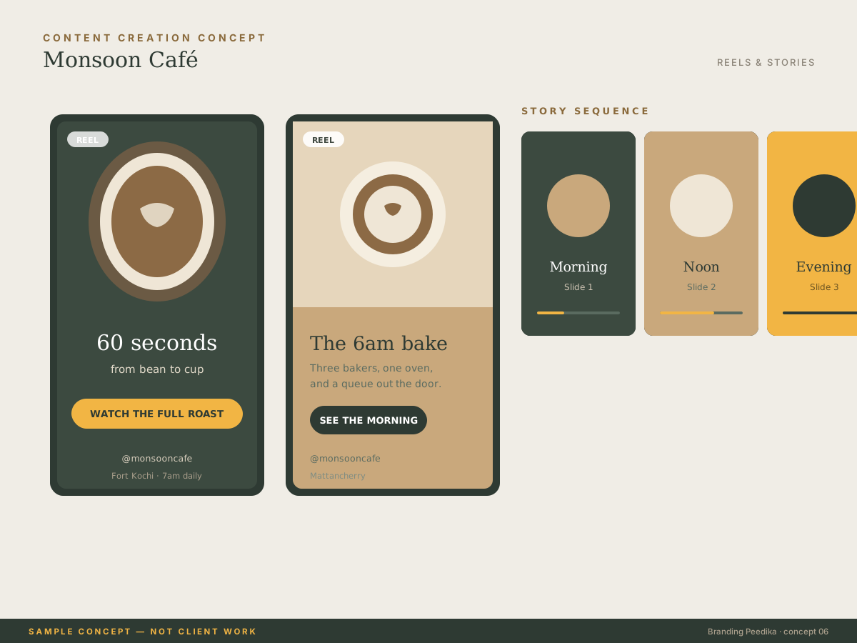 Short-form
Sample reel and story frames showing how a single shoot can feed several weeks of content.
How we think
The same three rules run through all of our work, whether it is a logo or a full website.
If someone cannot tell what a business does within a couple of seconds, the design has not done its job — however good it looks.
A brand that only works with a professional studio is no use to a one-person business. We design for what you can actually keep up.
Every page, post and ad has one thing it is asking the reader to do. Two calls to action usually means neither happens.
Working with us
The concepts above are the visible part. Underneath, every project follows the same predictable sequence.
Let's begin
Tell us what you sell and who buys it. We will come back with an approach and a realistic place to start.