Logo concepts
Two or three distinct directions, refined with your feedback into a final mark that works at shop-sign size and at profile-picture size.
- Primary and secondary marks
- Wordmark, symbol or combination
- Horizontal and stacked versions
Branding & logo design
A logo, a colour palette, a typeface and a short set of rules — so a customer recognises your business whether they see it on a shop board, a story, a menu or your website.
What is included
We design a small, practical system rather than a large decorative one. Everything is delivered in the formats you need, sized for the places your customers actually meet you.
Two or three distinct directions, refined with your feedback into a final mark that works at shop-sign size and at profile-picture size.
A palette with a clear role for each colour, and a type pairing that stays legible on a phone screen, a printed menu and a billboard.
A short, plain-language document showing how to use the identity correctly, so the look stays consistent even when different people make the designs.
The practical files you will actually reach for — social templates, a visiting card layout, a menu or a board design — exported in the correct formats.
Where a name is still being decided, we help you shortlist options and check that the shortlist reads well, says something sensible and is usable online.
A few pages on how to talk about the business — the words you use, the words you avoid, and the tone that fits a local business talking to real customers.
Who this is for
Most of the businesses we meet are not starting from nothing — they have a real product and real customers. What they are missing is a look that holds together.
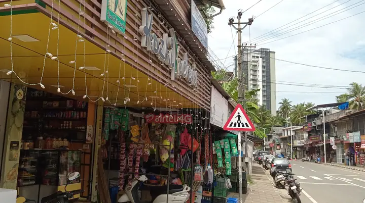
A shop board is the first thing a customer sees. The identity is what makes the board, the menu and the online post look like they belong to the same business.
How it works
You will always know which step we are on, and exactly what we need from you next.
We look at your business, your competitors and your customers, and agree on what the identity needs to achieve.
We present two or three distinct directions, each with a clear rationale you can react to rather than just "like" or "dislike".
Your feedback goes into the chosen direction, and we build out the palette, type, templates and guidelines around it.
You receive organised source files, exports and a short guide, plus a walkthrough so you can use it without us.
Before we start
Nothing here is compulsory. Each item simply removes a round of questions.
Timing note. Branding is the slowest part of a launch because it is the part that is hardest to redo. We would rather spend the extra week getting the direction right than hand you a logo you have to live with for the next five years.
Often paired with
Apply the new identity to the posts, stories and short-form video your customers see every week.
A site that carries the identity properly, loads quickly and turns visitors into enquiries.
Plan the channels, publish the content and keep the look consistent month after month.
Let's begin
Tell us what your business does and what still feels inconsistent. We will come back with a clear direction and an honest view of what to do first.